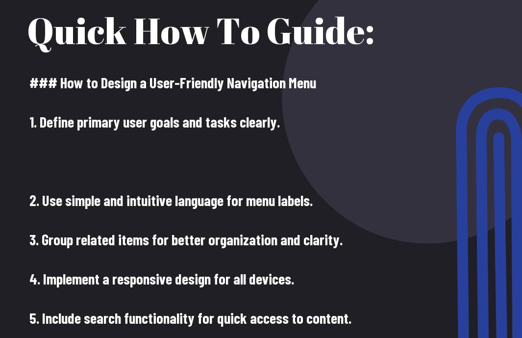
Navigation is key to both your website’s SEO success and user experience. By designing a user-friendly navigation menu, you can enhance how visitors interact with your site, leading to lower bounce rates and higher engagement. In this guide, you’ll learn how to optimize your navigation structure to make it easier for users to find what they’re looking for while improving your search engine rankings. Let’s investigate the crucial steps you need to take to create a navigation menu that benefits both your audience and your site’s visibility.
Key Takeaways:
- Simplicity: A clean and straightforward navigation menu allows users to find what they need quickly, enhancing their overall experience on the site.
- Consistency: Keeping the navigation menu consistent across all pages helps users navigate seamlessly and builds familiarity, which is beneficial for both usability and SEO.
- Mobile Optimization: Designing a navigation menu that adapts well to mobile devices ensures accessibility for all users, improving engagement and positively impacting search engine rankings.
Understanding the Importance of Navigation
Before you design your website, it’s necessary to recognize that effective navigation forms the backbone of a positive user experience and enhances your site’s SEO. A well-structured navigation menu not only helps users find what they’re looking for quickly but also aids search engines in understanding your site’s hierarchy and content relevance. This synergy between user experience and SEO can significantly influence your site’s success, leading to higher engagement and improved search rankings.
Navigation and User Experience
There’s a direct correlation between navigation and user experience; intuitive navigation allows visitors to explore your site effortlessly. When users can easily find information, they are more likely to stay longer, return, and engage with your content. A complicated or cluttered navigation system can lead to frustration, driving users away and increasing your bounce rate.
Navigation’s Role in SEO
Now, let’s examine into how navigation impacts your site’s SEO. An organized navigation structure assists search engine crawlers in indexing your pages more efficiently, potentially boosting your visibility in search results.
Role of navigation in SEO extends beyond mere indexing; it influences users’ behavior and ultimately your site’s credibility. A clear and logical navigation system encourages visitors to explore deeper content, which can reduce your bounce rate and increase session duration. Moreover, if users can easily navigate to important pages, it sends positive signals to search engines, enhancing your search rankings. In contrast, poorly designed navigation can lead to high bounce rates and decreased crawl efficiency, negatively impacting your site’s visibility. Understanding the balance between user-friendly navigation and SEO can yield significant benefits for your online presence.
How to Design an Effective Navigation Menu
While creating an effective navigation menu, focus on clarity and simplicity to enhance the user experience. A well-structured menu not only improves SEO by allowing search engines to crawl your site efficiently, but it also helps users find the information they need quickly. Prioritize necessary pages and ensure your menu is responsive to various devices. Balancing both user experience and search engine optimization will yield significant benefits.
Tips for Organizing Menu Structure
If you want to create a logical structure for your navigation menu, consider the following tips:
- Use clear and descriptive labels
- Group related items to form categories
- Limit the number of items to avoid overwhelming users
- Highlight important links for visibility
This approach will lead to a more intuitive navigation experience.
Factors to Consider for Accessibility
Clearly, ensuring your navigation is accessible is necessary for all users, particularly those with disabilities. Incorporate features such as:
- Keyboard navigability for users who cannot use a mouse
- Descriptive alt text for images and icons
- Color contrast to aid visibility
- Screen reader compatibility for effective communication
Thou must ensure that everyone can access your site effectively.
Understanding accessibility further allows you to enhance your navigation design. Good accessibility means your navigation will cater to a diverse audience, ensuring that every user, regardless of their physical abilities, can navigate through your content. Key aspects to include are:
- Provide consistent navigation across all pages
- Allow enough time for users to read and interact
- Utilize focus indicators for keyboard navigation
- Test with various assistive technologies
The focus on accessibility will not only enhance your user experience but also contribute positively to your brand reputation.
Optimizing for Mobile Navigation
Not optimizing your mobile navigation can lead to frustrated users and poor SEO rankings. For expert insights, check out Design an Effective Navigation Menu UX with These 4 Tips. A seamless mobile experience is vital for retaining visitors and improving search engine visibility.
Essential Mobile Navigation Tips
Even small adjustments can enhance your mobile navigation. Keep these tips in mind:
- Simplicity: Use a clean design.
- Visibility: Ensure all options are easily reachable.
- Touch-friendly: Create larger clickable areas.
- Feedback: Provide visual responses to user actions.
Assume that implementing these tips will significantly improve your mobile user experience.
Factors Influencing Mobile User Experience
Now, several factors shape how users interact with your mobile site. Focus on these key elements:
- Load speed: Optimize images and scripts.
- Responsive design: Ensure your site adapts to various screen sizes.
- Navigational clarity: Minimize layers in your menu.
You must prioritize these factors to ensure a smooth user journey.
Navigation plays a significant role in shaping the mobile user experience. Focusing on these factors will enhance usability and keep your visitors engaged:
- Consistent layout: Maintain design throughout.
- Accessible menus: Ensure easy access to all pages.
- User feedback: Incorporate user suggestions into updates.
You will find that optimizing these aspects can lead to higher engagement and reduced bounce rates.
Enhancing Visual Hierarchy in Navigation
After establishing a solid framework for your navigation, you need to focus on enhancing the visual hierarchy. This approach helps guide users intuitively through your site, making important elements stand out while ensuring less vital components remain accessible but unobtrusive. By strategically organizing links and prioritizing items based on relevance, you improve not only SEO but also the overall user experience.
How to Use Colors and Fonts Effectively
The choice of colors and fonts plays a significant role in establishing a strong visual hierarchy. Use contrasting colors for your call-to-action buttons and navigation links to draw users’ attention. Avoid clutter by limiting font styles and utilizing consistent sizes, ensuring that your labels are easily legible. Overall, orchestrating color and typography can dramatically influence how users interact with your menu.
Tips for Iconography and Labels
Visual elements such as icons and well-crafted labels can significantly enhance your navigation’s effectiveness. When using icons, ensure they are universally recognized and support your text labels for better comprehension. Keep your labels descriptive yet concise to facilitate quick understanding. Here are some quick tips:
- Choose icons that are intuitive and relevant.
- Avoid using jargon; opt for clear language.
- Consistency in style will aid recognition.
Knowing how to align your iconography with your navigation can streamline your visitor’s journey, making it more enjoyable.
Visual elements are crucial for fostering a seamless user experience. For instance, integrating icons with text labels can improve comprehension and retention. Icons should be simplistic and meaningful, directly correlating with their respective functions—this will help avoid confusion. Furthermore, maintaining a consistent icon style across your site reinforces the navigation system, creating familiarity with your audience. Regularly evaluate your choices to ensure they meet users’ expectations and behaviors. Here are some additional tips:
- Test your icons with users for effectiveness.
- Keep backgrounds transparent to enhance visibility.
- Regularly audit your labels for relevance.
Knowing how to utilize iconography and labels effectively can create a more meaningful and engaging navigation experience for your users.
Testing and Analyzing Navigation Usability
Now that your navigation menu is designed, it’s necessary to test and analyze its usability. Conducting tests will not only help you identify areas for improvement but also enhance SEO and user experience. You can explore more about What are the key principles of creating a user-friendly … to ensure your navigation is effective and efficient.
Methods for Gathering User Feedback
With various techniques at your disposal, actively seeking user feedback on your navigation menu can illuminate what works and what needs adjustment. Utilize quizzes, polls, or direct user interviews to gather insights on their experiences and preferences.
How to Leverage Analytics for Improvement
Analyzing your site’s traffic and user behavior through analytics tools is necessary for continual navigation enhancement. By examining metrics such as bounce rates, click paths, and exit points, you can gain substantial insights into how users interact with your navigation.
Navigation patterns revealed by analytics tools can highlight important areas for improvement. For instance, if you notice a high exit rate on a particular page, it suggests that users may struggle with locating further information. Additionally, frequent clicks on certain links could indicate that users find those options helpful, emphasizing their importance in your structure. Make data-driven adjustments to optimize your navigation, improving both SEO rankings and user satisfaction.
Best Practices for Ongoing Maintenance
Once again, maintaining an effective navigation menu requires consistent attention and adjustments. Regular assessments can enhance both your SEO and user experience by ensuring your navigation remains clear, relevant, and optimized for search engines. By staying updated with trends and user preferences, you’ll keep your website friendly and engaging.
How to Regularly Update Navigation
An effective way to keep your navigation fresh is by periodically analyzing user feedback and site performance metrics. Adjust your menu items based on the user behavior data, ensuring that your most popular pages are easy to access. This will help in improving user experience and driving traffic to your necessary content.
Tips for Monitoring User Behavior
With regular monitoring, you can gain insights into how visitors interact with your navigation. Consider utilizing tools like Google Analytics or heat maps to track clicks and navigation paths. These insights can help you pinpoint areas that need improvement, such as confusing menus or underperforming links. Thou, tracking this behavior will guide your ongoing adjustments.
This proactive approach to analyzing user behavior reveals patterns that inform your navigation strategy. Ensure you pay attention to various metrics such as bounce rates, click-through rates, and session durations, as they provide valuable information about how effectively your navigation is functioning. Focus on enhancing user satisfaction leads to improved overall performance. Thou, adapting based on these insights will enhance your site’s usability.
Conclusion
Summing up, designing a user-friendly navigation menu is vital for enhancing your website’s user experience and boosting SEO performance. You should prioritize clarity by using intuitive labels and a logical structure that makes it easy for users to find what they need. Additionally, incorporating responsive design ensures accessibility across devices. By focusing on simplicity and efficiency, you can guide visitors through your site seamlessly, which encourages engagement and can lead to improved search engine rankings.
FAQ
Q: What are the key elements to include in a user-friendly navigation menu?
A: A user-friendly navigation menu should include clear labels and categories that accurately reflect the content on your site. Use familiar terms and avoid jargon to make it easy for users to understand where they are going. Additionally, it is helpful to organize your menu logically, ensuring that related items are grouped together. Implementing a search bar can also enhance usability, allowing users to find specific content quickly. It’s also important to ensure the menu is accessible on all devices, utilizing responsive design principles to accommodate mobile users.
Q: How does the structure of a navigation menu impact SEO?
A: The structure of your navigation menu significantly affects SEO as it helps search engines understand the hierarchy and importance of content on your website. A well-organized menu allows search engines to crawl and index your pages more effectively, ensuring that relevant content is discovered and ranked appropriately. Use keyword-rich labels for menu items to improve the chances of ranking for those terms. Furthermore, a clear navigation structure can reduce bounce rates and improve user engagement metrics, which are important signals for search engines evaluating the quality of a website.
Q: What best practices should be followed to enhance navigation for better user experience?
A: To enhance navigation for a better user experience, follow these best practices: keep the menu simple by limiting the number of top-level items, ensure that links are easily clickable and distinguishable, and use consistent placement across the site for familiarity. Consider implementing breadcrumb navigation to help users understand where they are within the site structure. Testing your navigation with real users can provide valuable feedback on usability, so conducting usability testing can identify potential pain points. Also, consider including a sticky navigation feature that keeps the menu accessible as users scroll down the page.